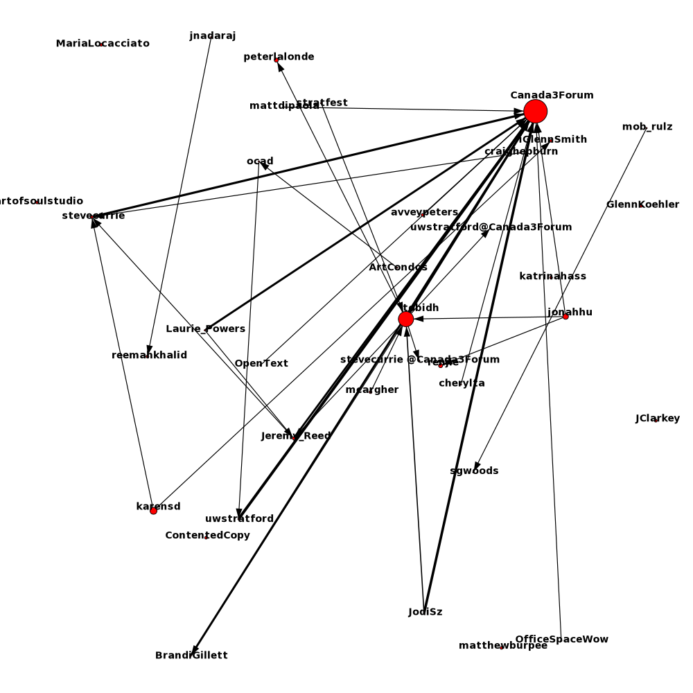
The other day I found Gephi which was used to create these amazing graphs based on GitHub data. So I thought it might be fun to pull some data into Gephi and play with it. I decided on using the Twitter API to obtain all of the Tweets related to the upcoming Canada 3.0 conference in Stratford, ON, CA. I used the ‘can30’ hash tag as the search term but since the Twitter search only returns Tweets less than seven days old the history is limited.
I used Python and igraph to create the graph and exported it to GraphML which Gephi can import. Here’s the resulting GraphML file if you are interested.
I also used igraph to export PNG and SVG versions.
The nodes in the graph are Twitter users. The size of the node is relative to the number of new Tweets with the #can30 hashtag. By ‘new’ tweets I mean not re-Tweets. The edges represent re-Tweets and the width of the edges are relative to how many times the source user re-Tweeted the destination.
Based on the graph, Canada3Forum is the largest source of new Tweets followed by tobidh and there are lots of users re-Tweeting Canada3Forum’s messages.

We think very alike my friend! I started using Gephi playing with Gephi recently too. Someone posted and used it to visually show some malicious traffic — it was well done.
Like your Twitter graph above.
-mike